SmartMove: a real estate mobile app
Exploring a new user experience to find your dream home
What is SmartMove?
Smartmove is a real estate mobile application that lets users browse, create searches, bookmark their favorite homes and receive instant notifications when a new home on the market appears within their search criteria. What makes Smartmove unique is through the onboarding process, Smartmove gives the option to receive tips and guidance for new home buyers.
The Challenge
With so many real estate mobile applications out there, the challenge was to design and build an app that is easy to use and provides customizable filter options for users to narrow down their search and provide guidance so that users receive a more personalized experience.

Beginning User Research
I started my user research by creating a survey to learn more about the demographics, how much users know about the home buying process and what are the main reasons for using a real estate mobile app to search for homes. After I gathered enough information from the survey, I conducted interviews to gain more insight into what are the main problems that users struggled with while using these apps or just the home buying experience in general.
Findings
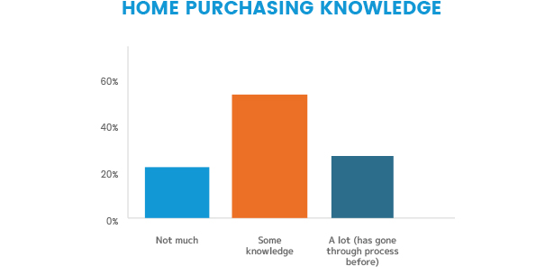
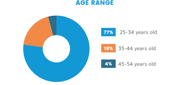
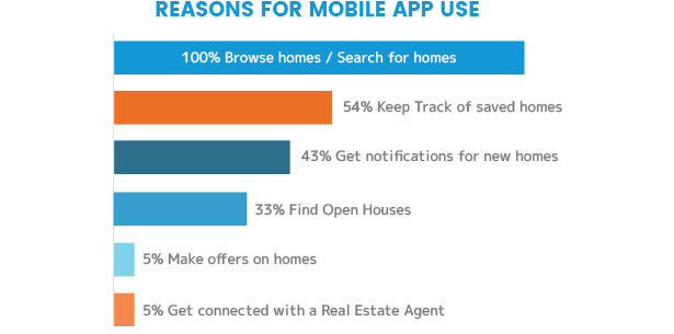
76% of the survey respondents were between the ages of 25-34 years old and 52% of them had some knowledge about purchasing or selling a home. While 72% began their most recent search for a home by using a real estate website, 40% of respondents contacted a real estate agent instead. This shows most young adults would rather do initial research on their own instead of seeking help from a real estate agent. Respondents noted that they liked using mobile applications because:
- They are easy to use,
- Kept their saved searches
- Gave them the ability to browse on the go
- Provided filters for searches
- Enabled the user to circle zones on a map to narrow down their search
In addition, respondents noted they disliked mobile applications because:
- Didn’t provide a financial/cost calculator
- Didn’t have enough details presented on listings
- Websites are easier to browse through verses mobile
- Search results displayed irrelevant homes
Competitive Analysis
Based on the insight that I gained from the initial survey and interviews, I found the three main competitors on the market and conducted a heuristic analysis on: Redfin, Zillow and Realtor.com
Recognition rather than recall
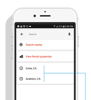
Realtor.com: When searching, the user is presented with cities they have previously searched for, this improves usability over needing to recall items from scratch.
Flexibility and efficiency of use
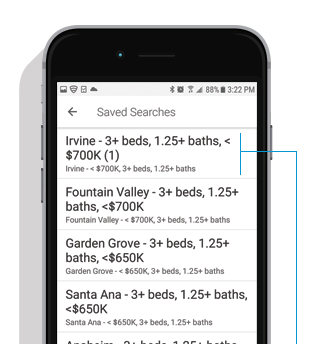
Redfin: It’s not evident how to delete or edit a “Saved Search”. This may slow the inexperienced users as they might not know to press and hold to bring up options to modify or delete.
Help and documentation
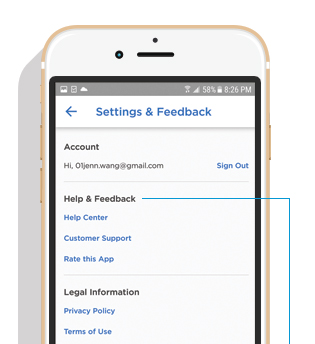
Zillow: Selecting the “Help Center” brings the user to many sections but there is no information to guide new home buyers through the home purchasing process.
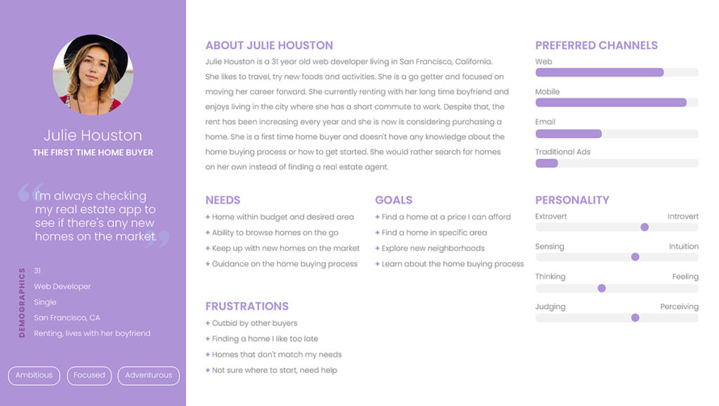
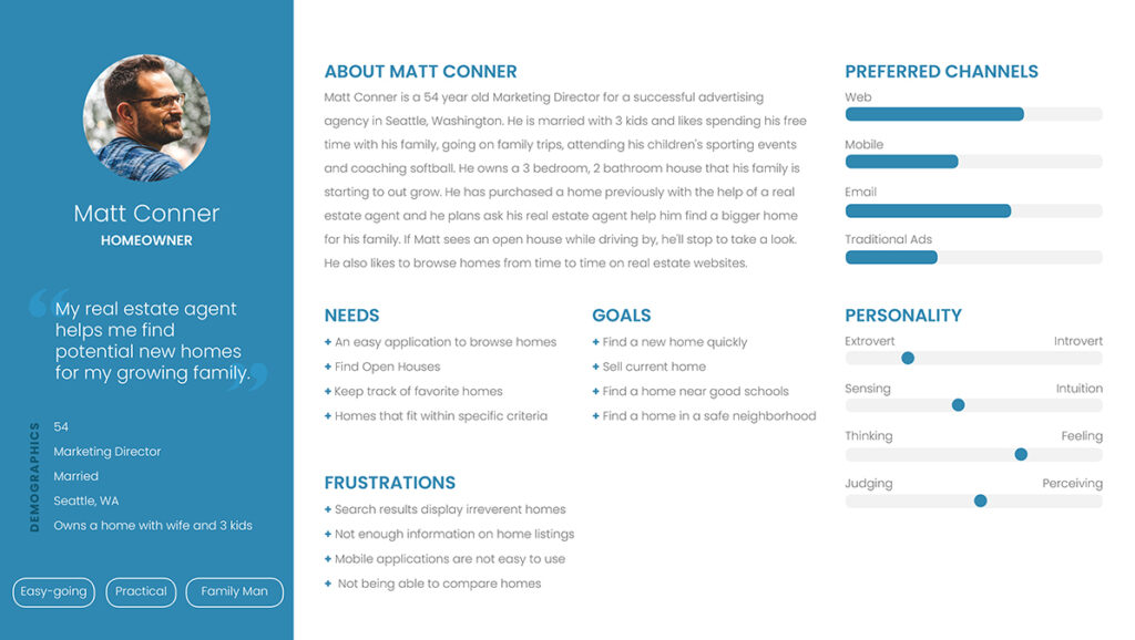
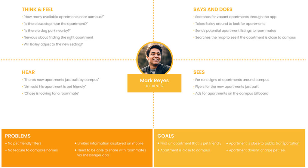
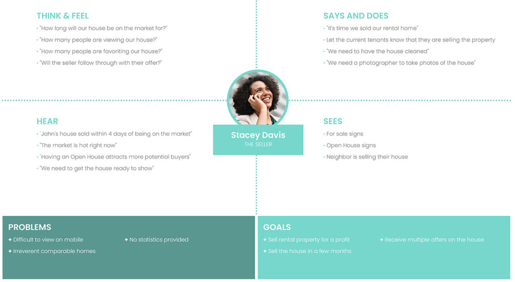
Personas and Empathy Maps
The First Time Home Buyer, The Homeowner, The Renter, The Seller
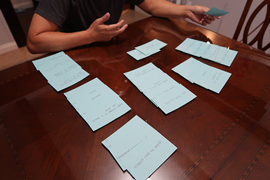
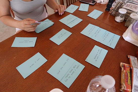
Card Sort
Participants that fit the user personas were recruited to complete the card sort. Some tasks were easily grouped and classified by all participants, tasks that fell under the categories:
- “Filtered Search“
- “Settings“
- “Saved/Bookmarks“
Detailed results can be found here.
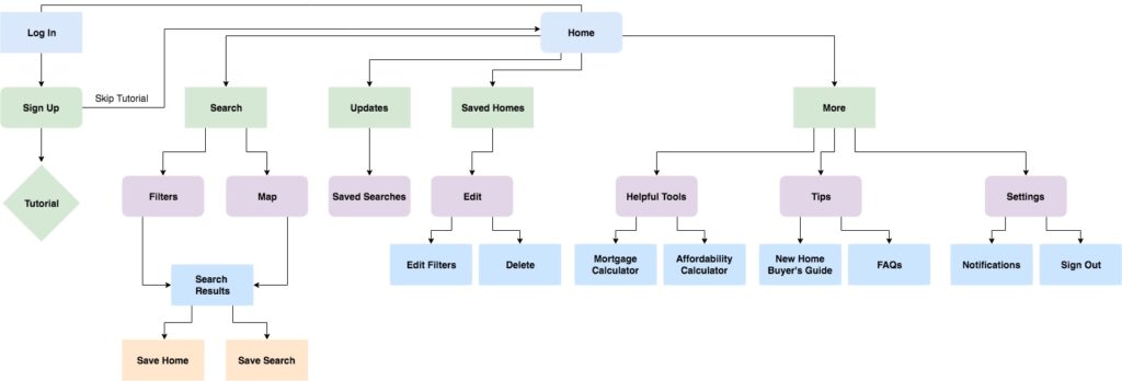
Site Map
From the data I gathered from the card sort, I created the site map for the application using Draw.io.
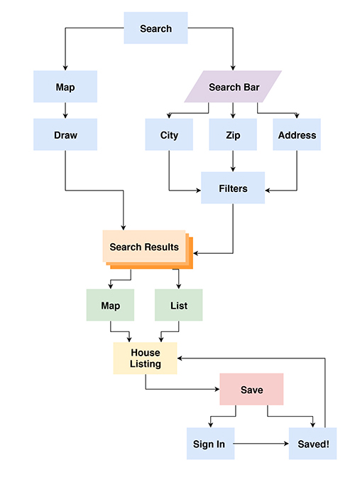
User Flows
To create the user flows, I went back to my personas, empathy maps and user stories to create task-driven user flows which helped to develop the overall application architecture and refine the site map. User flows were created with Draw.io.

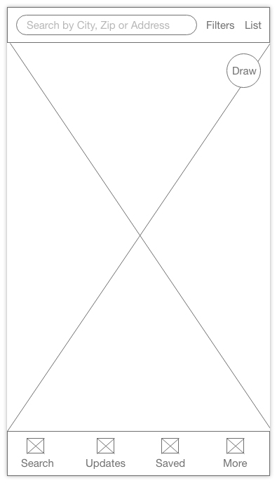
Home Screen
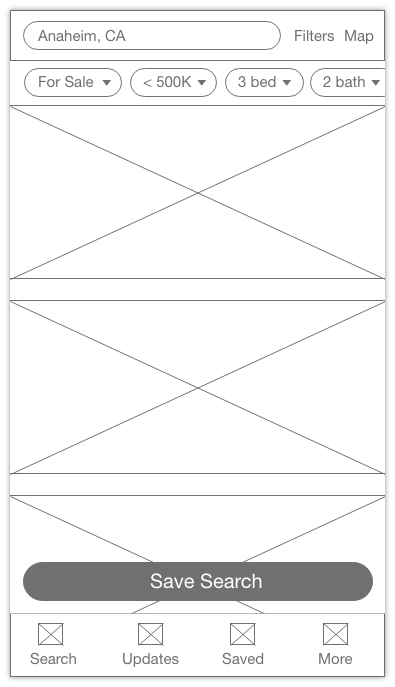
Search Results
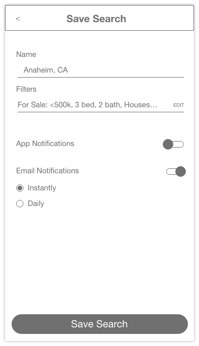
App Notifications Settings

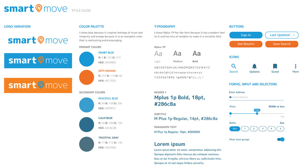
Style Guide
Guidelines created for the logo, color palette, typography, buttons, text fields and icons.
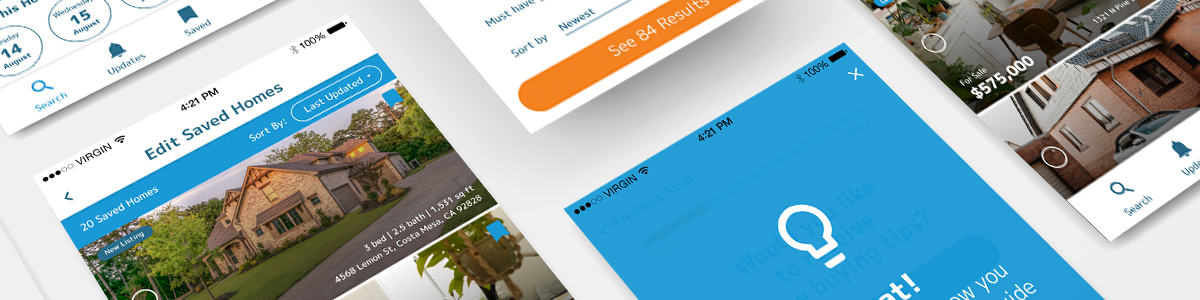
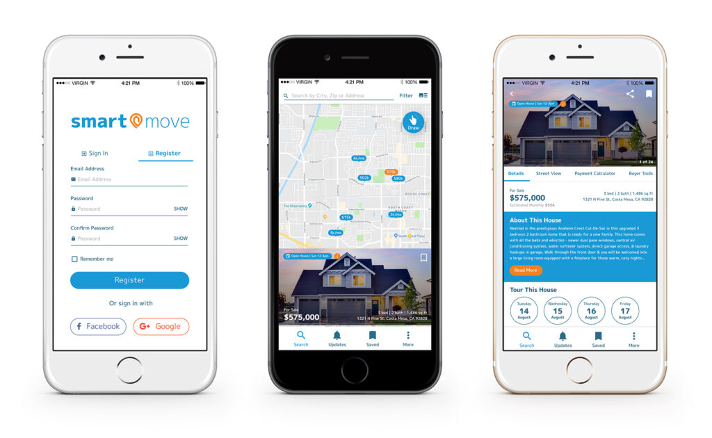
Final Screens

User Testing
Users that fit the personas were asked to test the prototype and complete the following tasks:
- Create an account as a first time user and complete onboarding
- Toggle between Map and List functions
- Create a Saved Search
- Edit a Saved Search
- Save a house
- Remove a house from Saved
Overall the user testing went well and all users were able to complete the tasks with no issues.
Evaluation
Overall, I learned a great deal from working on this project. I think the most important thing I learned is to constantly go back to the personas, user stories and user flow to make sure that the user’s pain points are in mind when designing the solution.
From the feedback gathered, I’ll focus on updating the language and structure within the app.
- “Saved” seems to be too broad and some users confused it for “Saved Searches”.
- “Updates” also confused users because they did not expect to find their “Saved Searches” under “Updates”.
- Users also thought “Updates” just showed them new homes in general verses seeing new homes within their search criteria.
- Users felt that Saved Searches should have their own section/tab or be accessible through their account section.